DX17
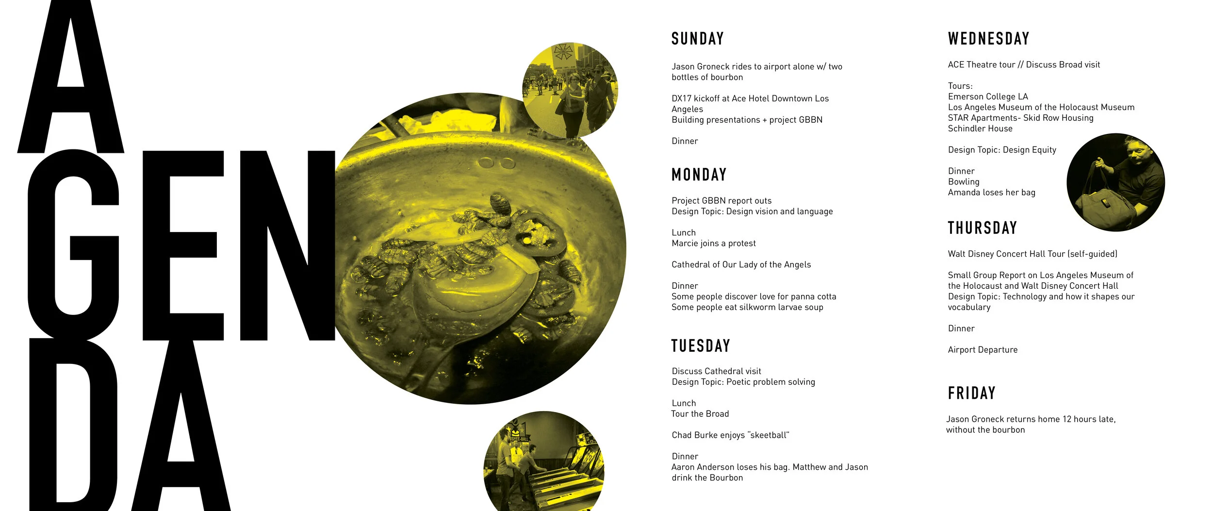
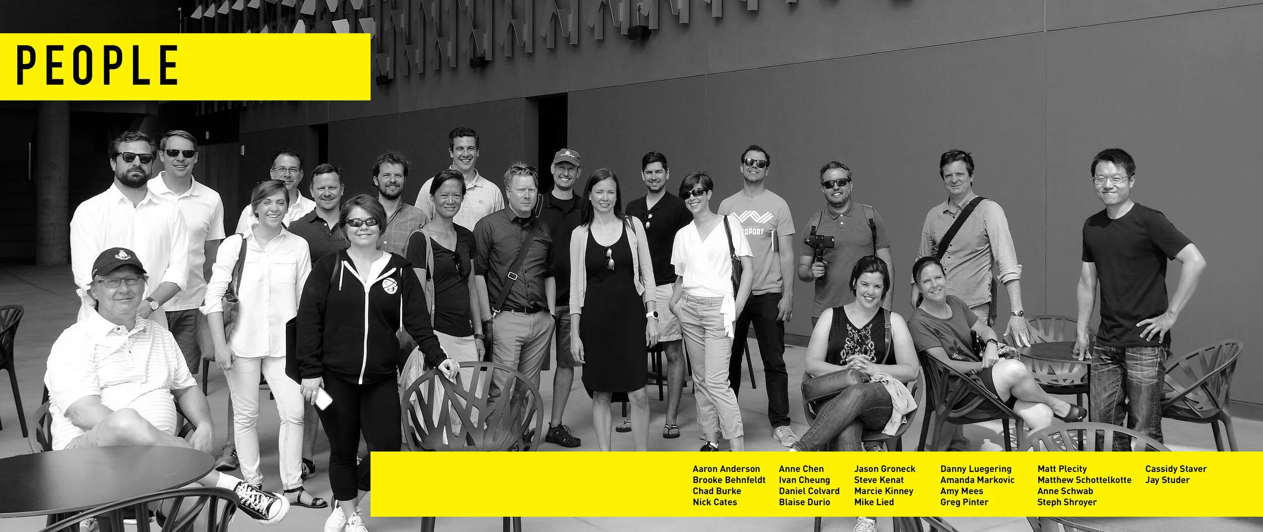
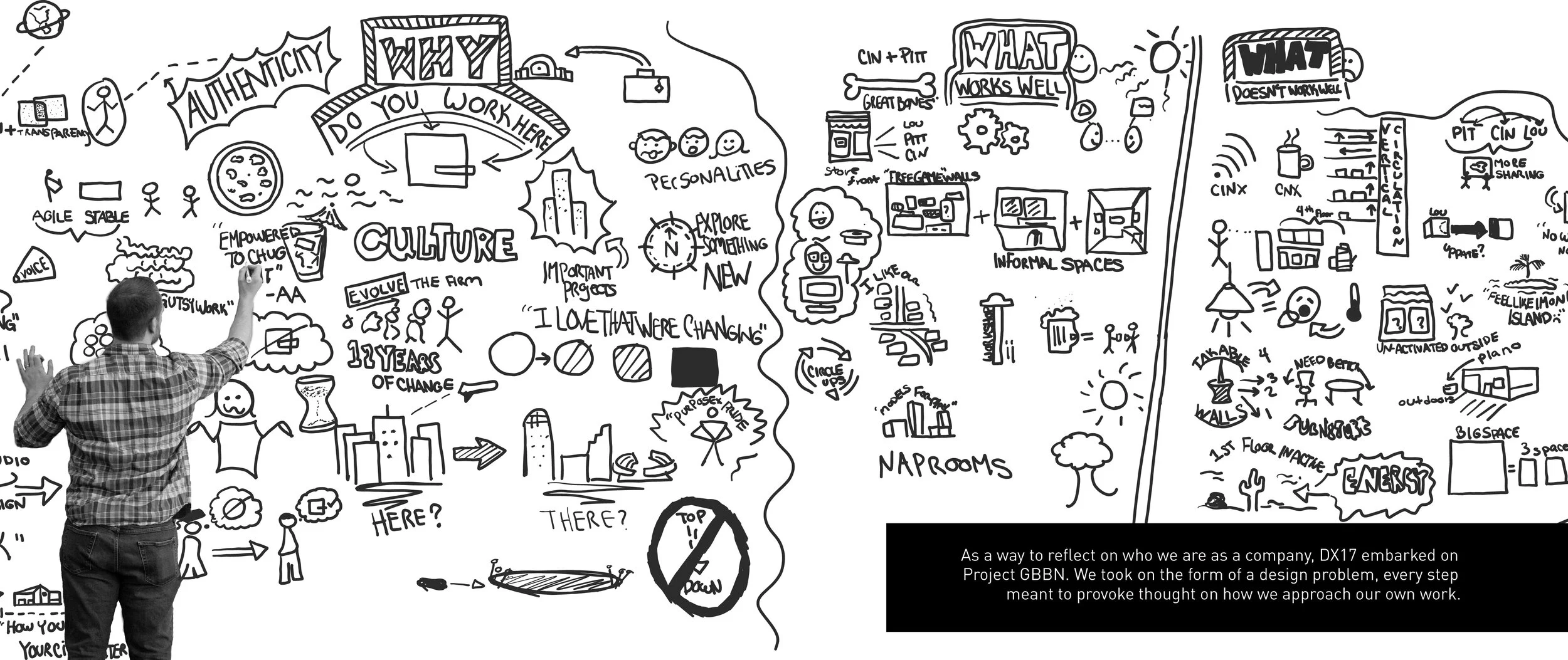
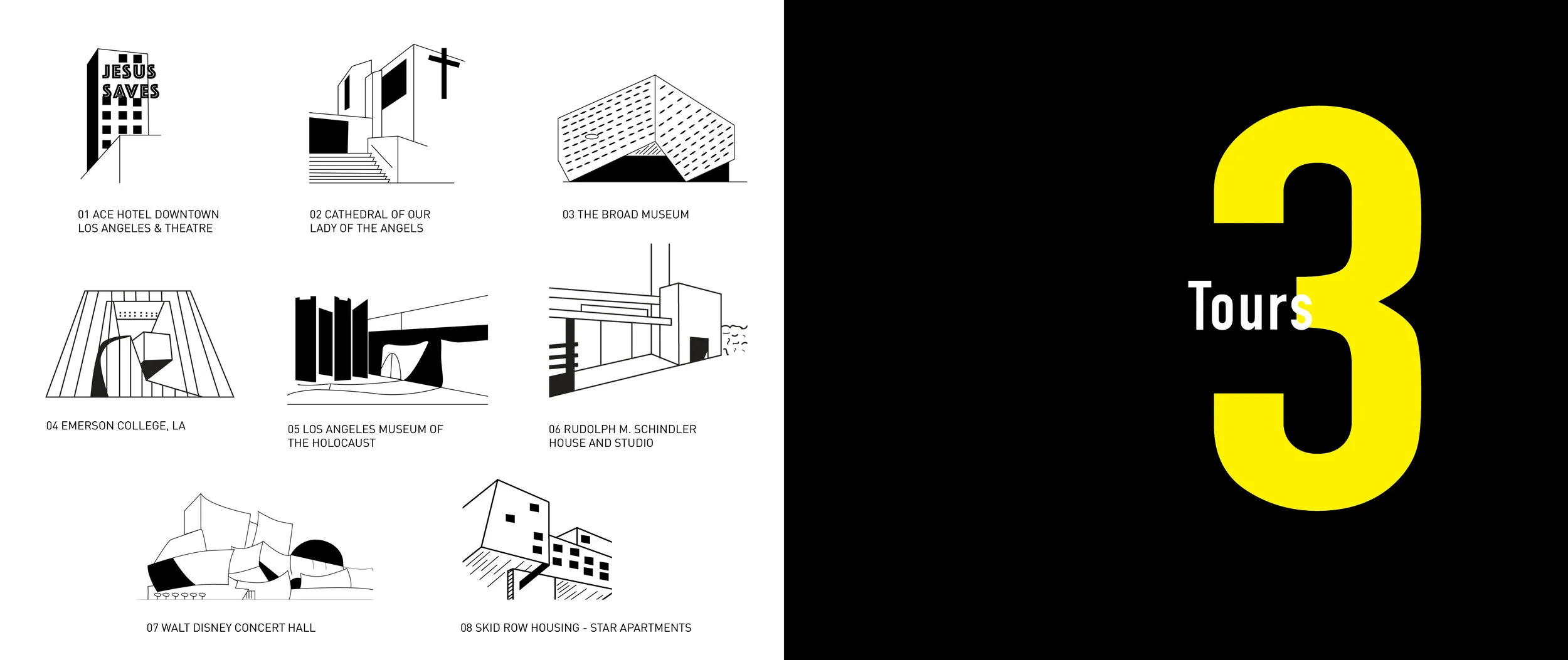
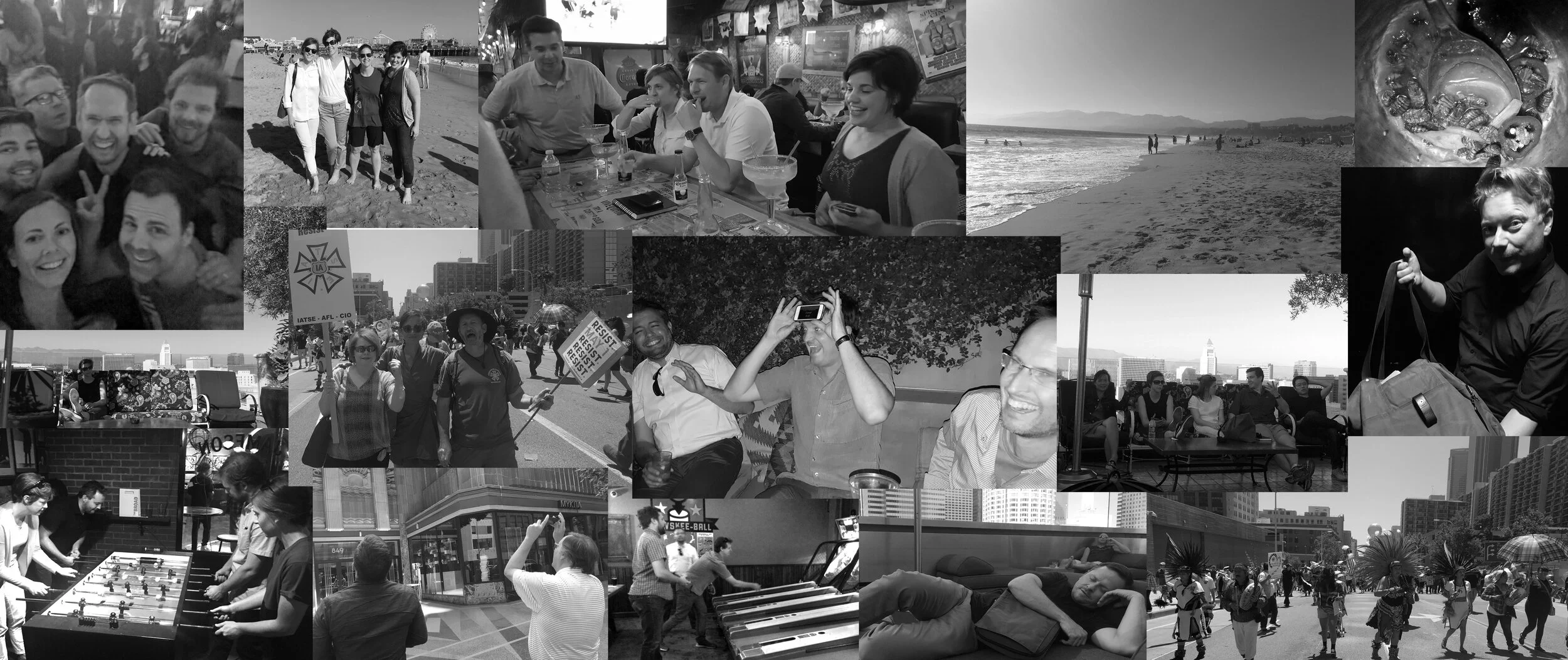
At GBBN, the office has a yearly trip somewhere in the world to explore iconic architecture, see innovative design, and have people from all offices together to build cross- office connections. In 2017, they traveled to Los Angeles to see many projects that took risk in the architecture and interior design world.
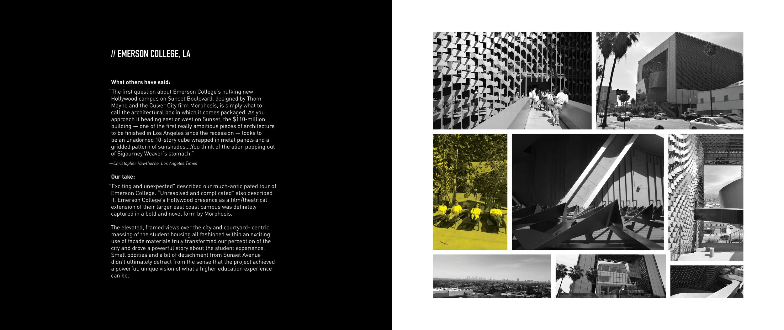
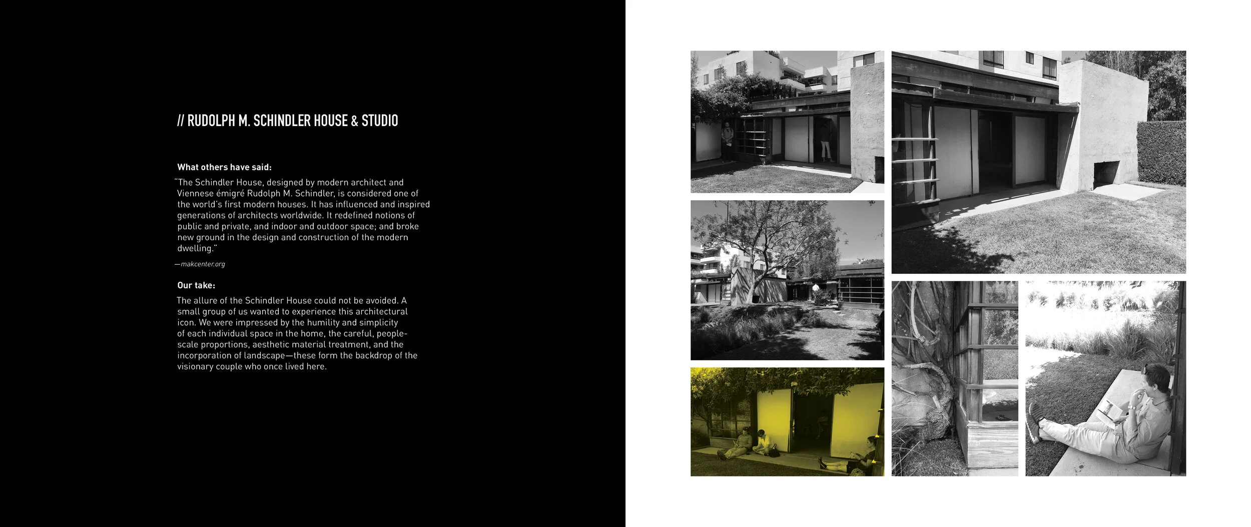
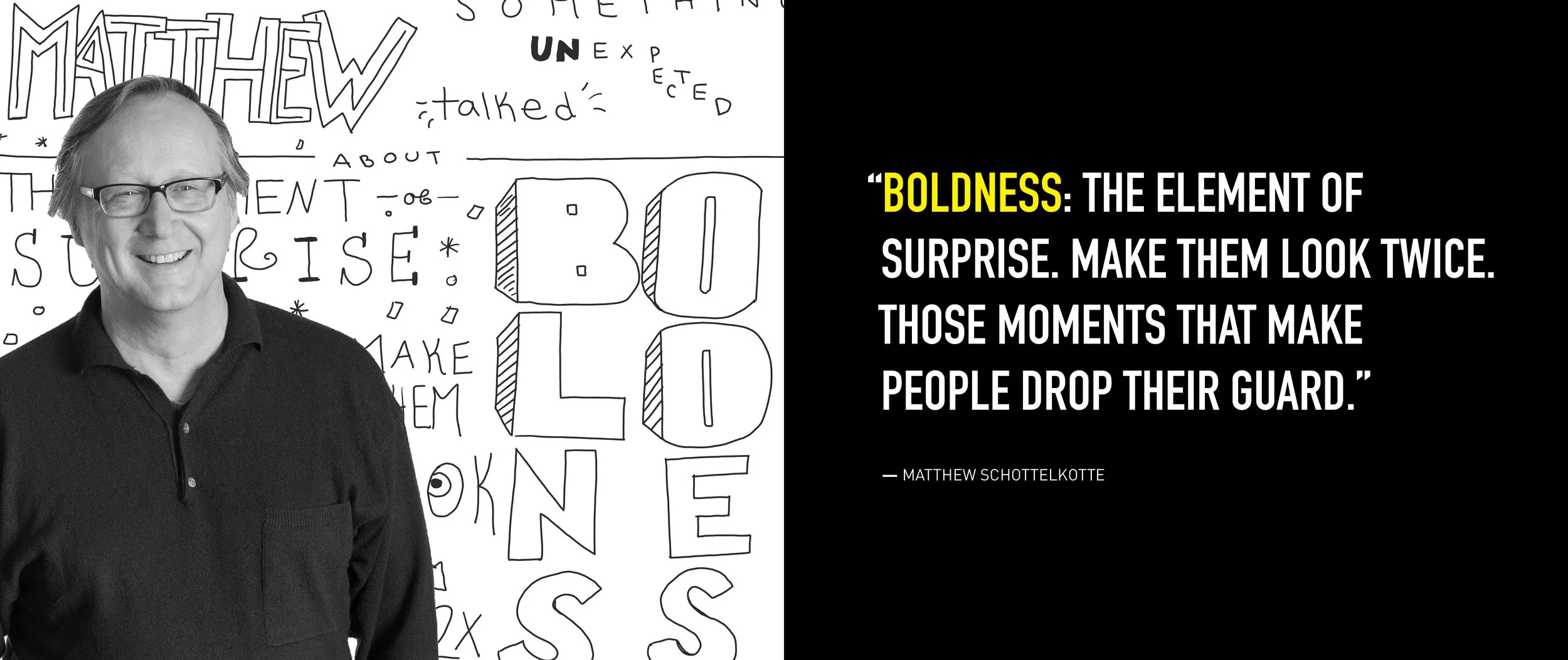
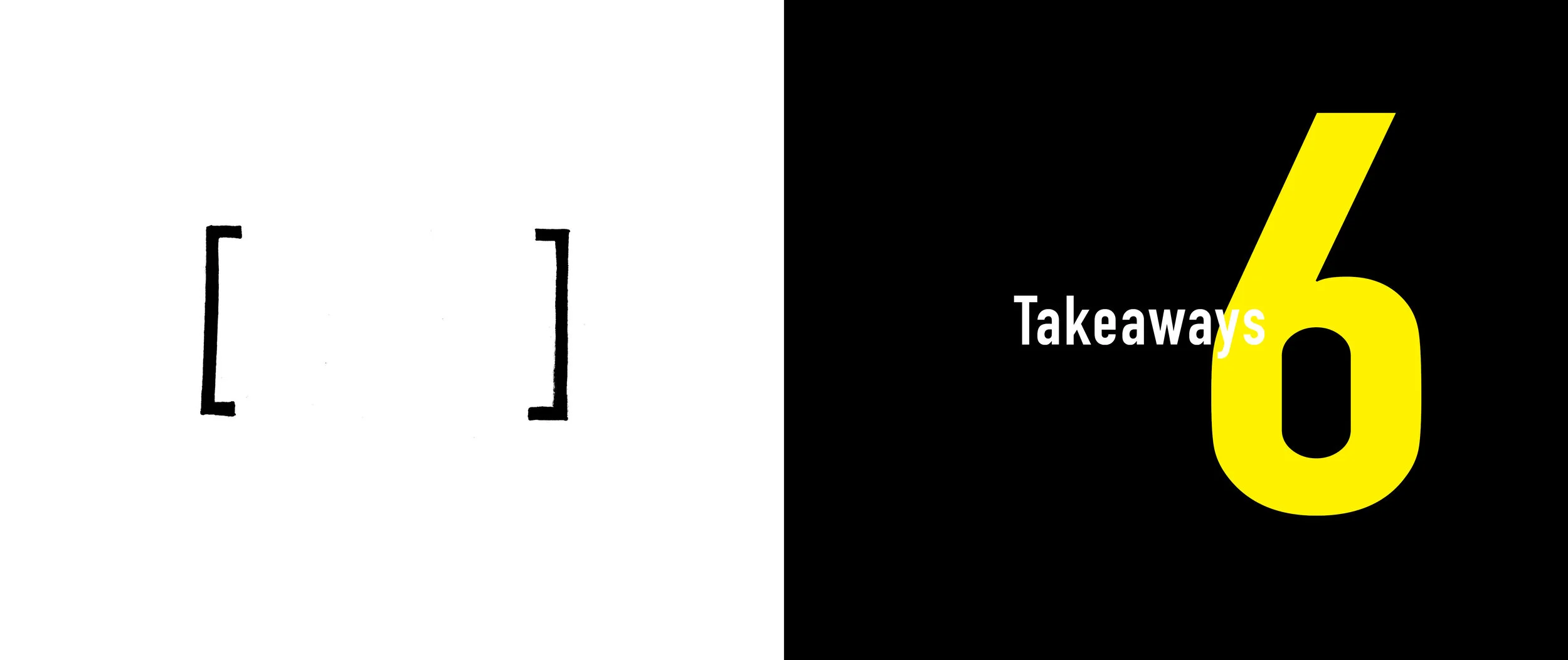
After each trip they create books to help document their trip, and to remember the important ideas and connections that were made to bring back to the office. DX17 as a book highlights connections made, and is black and white to provide balance of polar extremes. I felt like this represents the firm and LA as a whole. The risk and the contrast with the simplicity provides balance and a sense of unity, and the pop of color (yellow) highlights the people there and provides a global graphic element throughout the book.
GRAPHIC LAYOUT - ITERATIVE PROCESS - print design
A LOT of process went into this book.
Spread Process
Final Spreads

